DIONE
The night shift.
Evening skincare. Logo, packaging, store, banners, social, print
 BeforeAfter
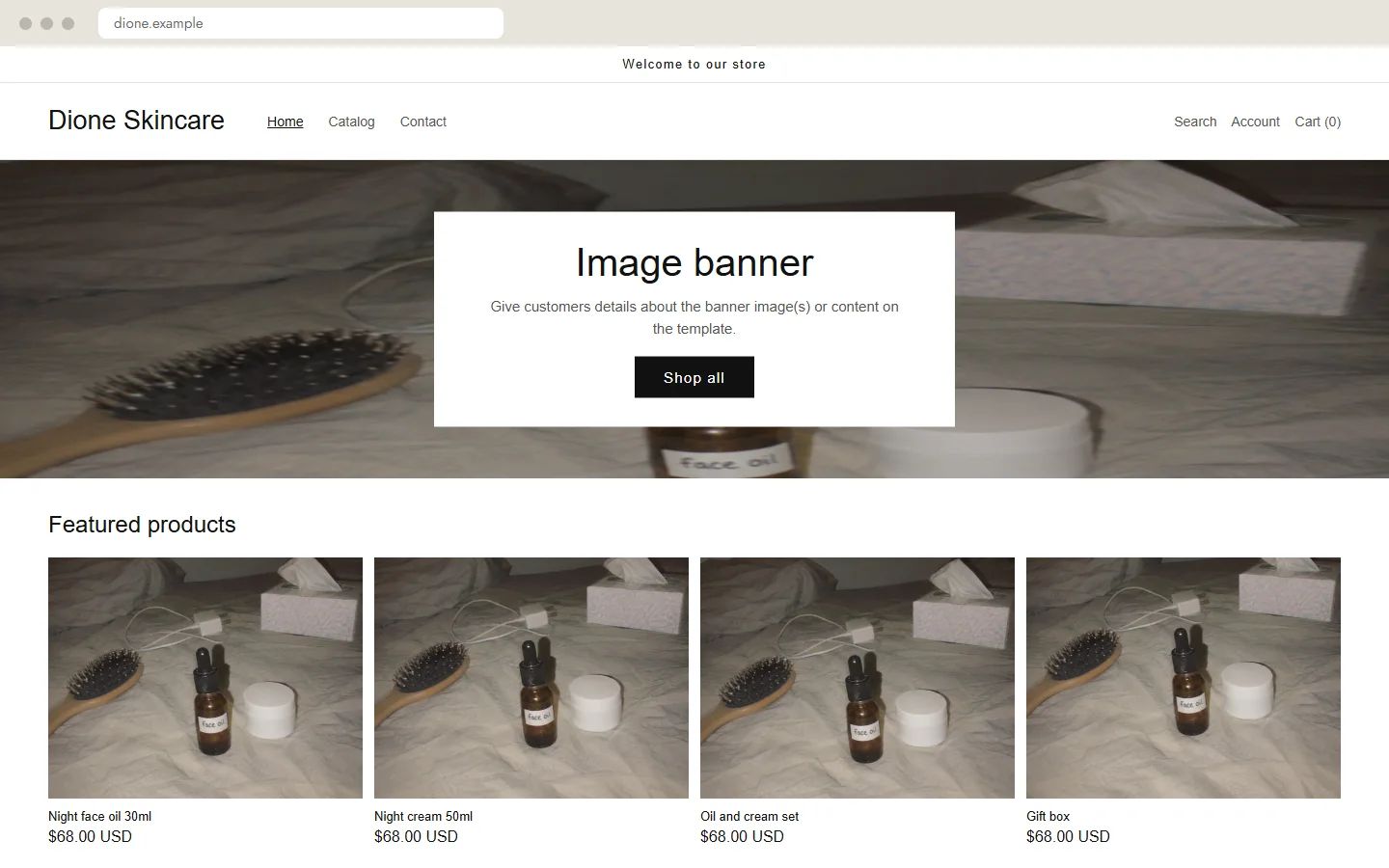
- Before
- An empty default theme, with the bedroom photo stretched across the banner.
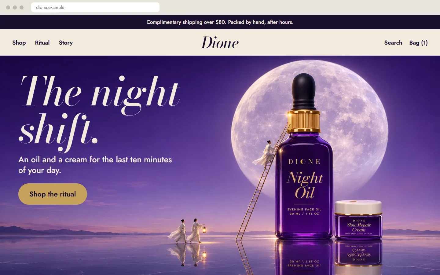
- After
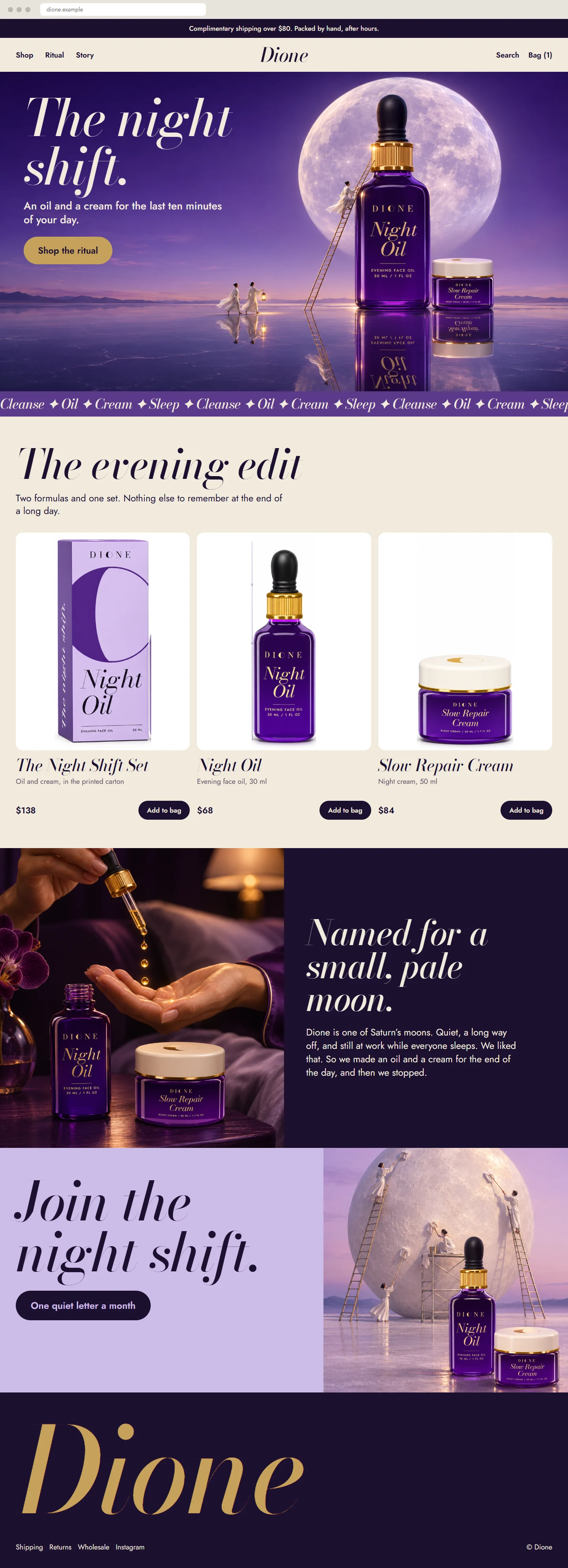
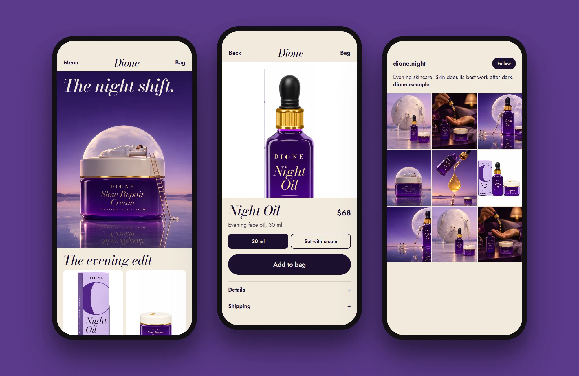
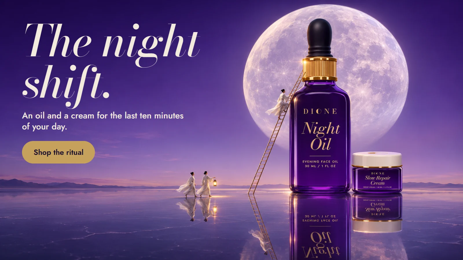
- A calm, dark home page built around one line: The night shift.
This shop is not real. I made it to show what a full project looks like, and I made the “before” versions too. The name, products, prices and addresses are invented.
The idea
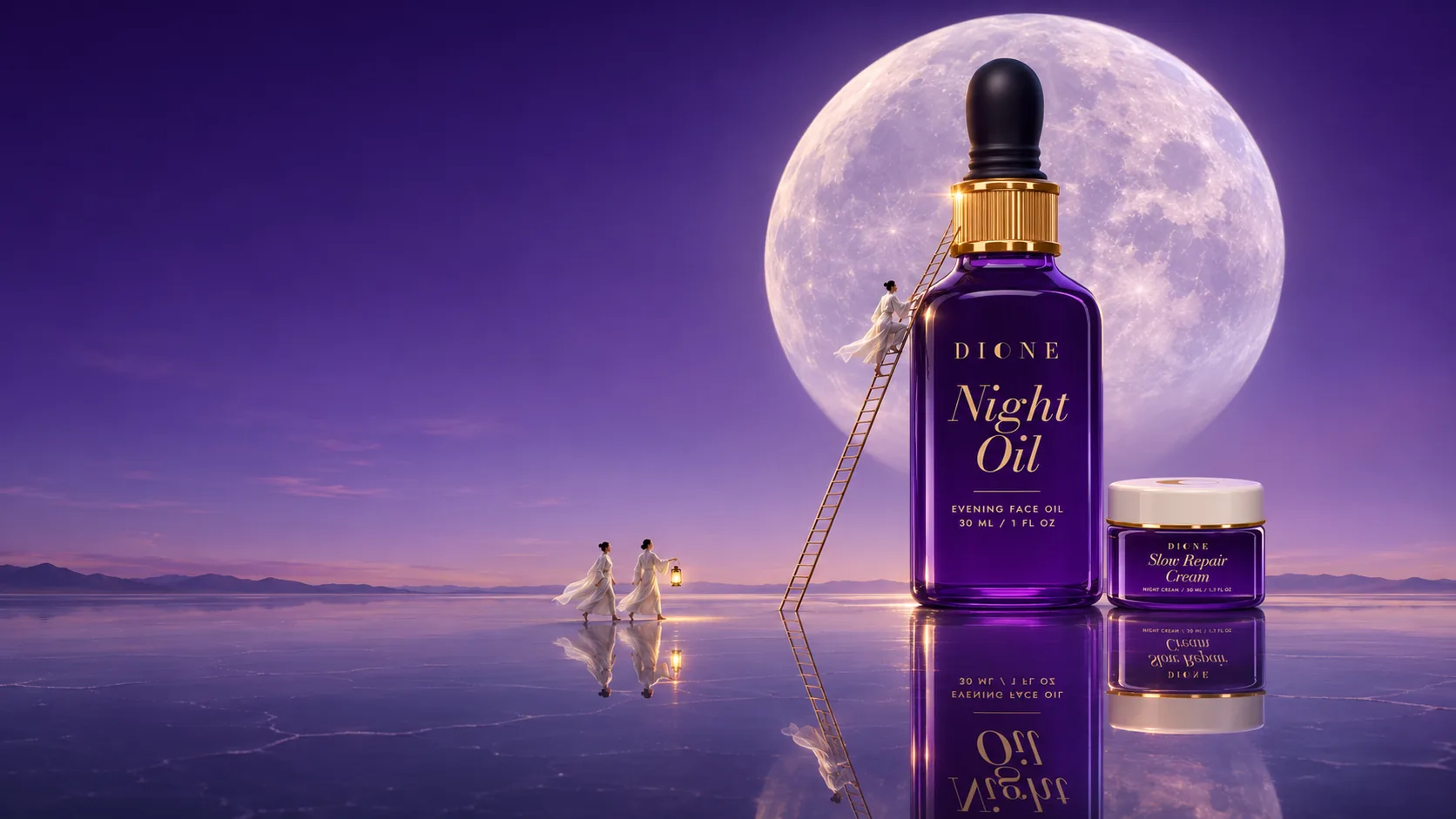
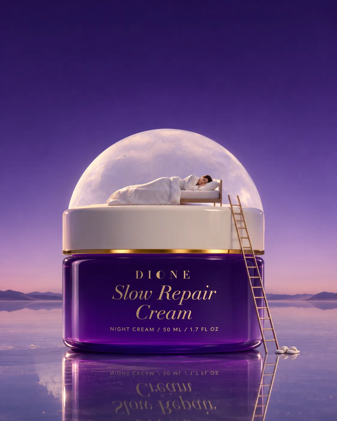
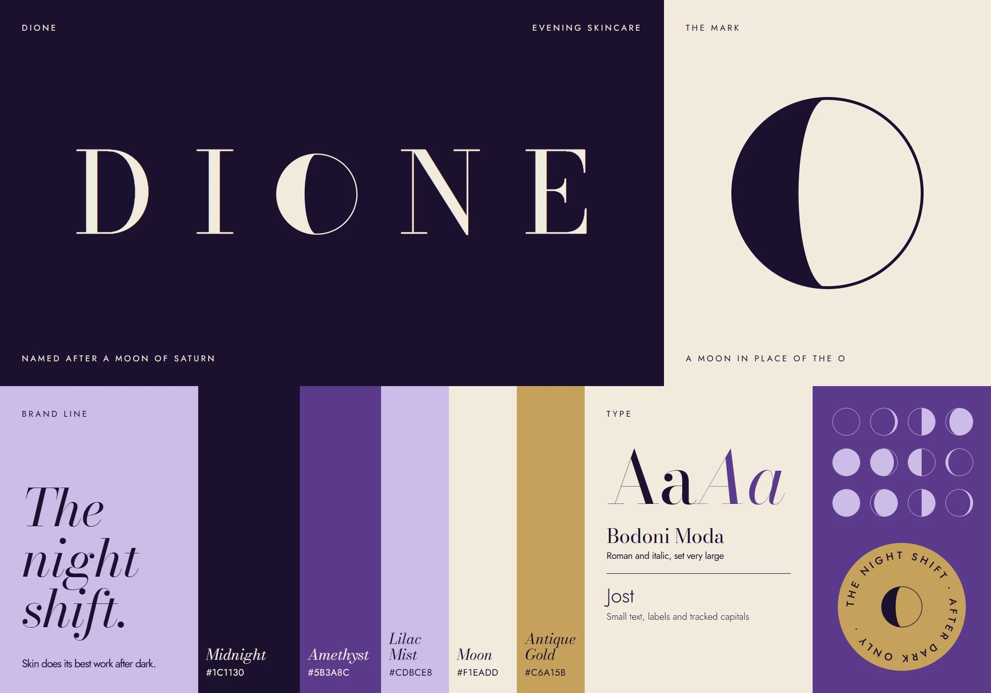
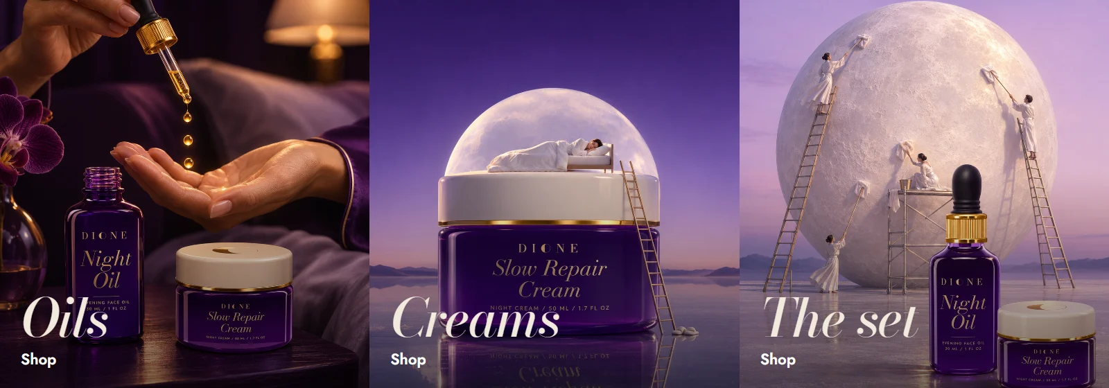
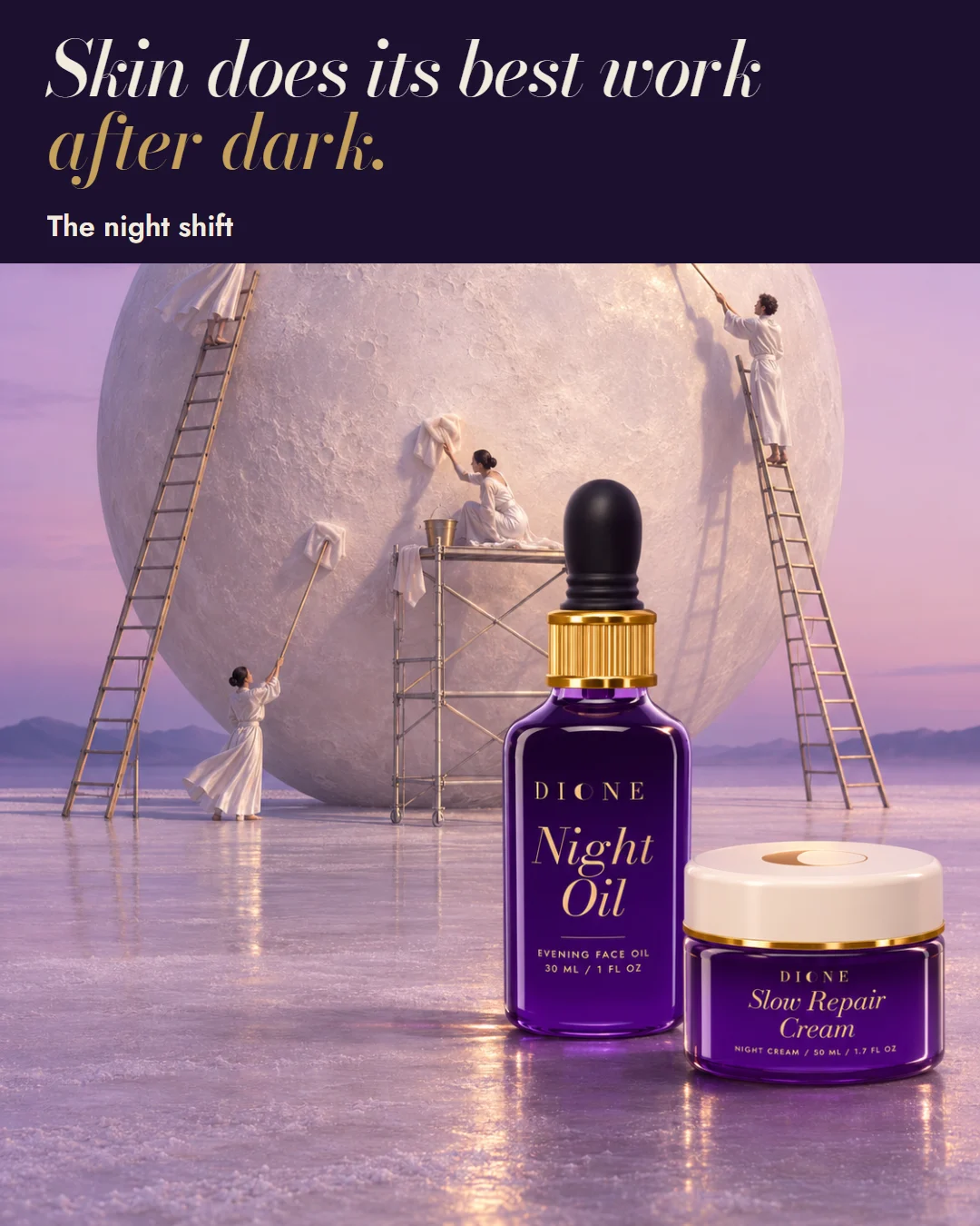
Skincare for the end of the day, named after a moon of Saturn. A moon replaces the O in the logo, then grows into a very large pale sphere behind violet glass and gold. Elegant letters and a lot of empty space keep every layout calm and expensive.
- Category
- Evening skincare
- Typefaces
- Bodoni Moda, Jost
- Colours
- Midnight, Amethyst, Lilac Mist, Moon, Antique Gold
Piece by piece, before and after.
 BeforeAfter
Logo and brand kit
- Before
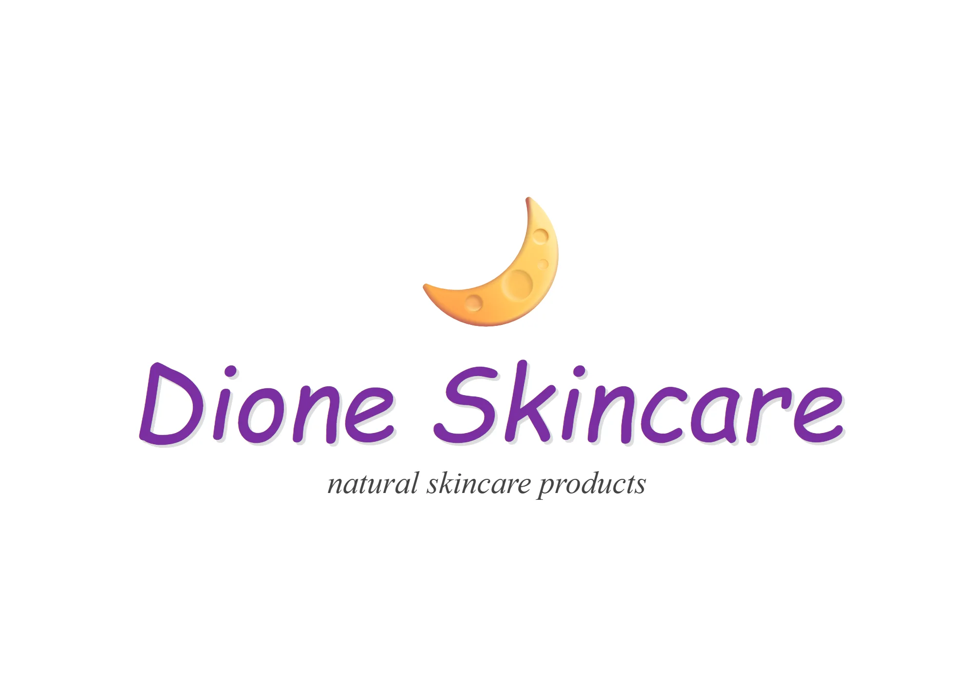
- The name in a handwriting font, under a moon emoji.
- After
- Elegant letters with a moon in place of the O, in purple and gold.
 BeforeAfter
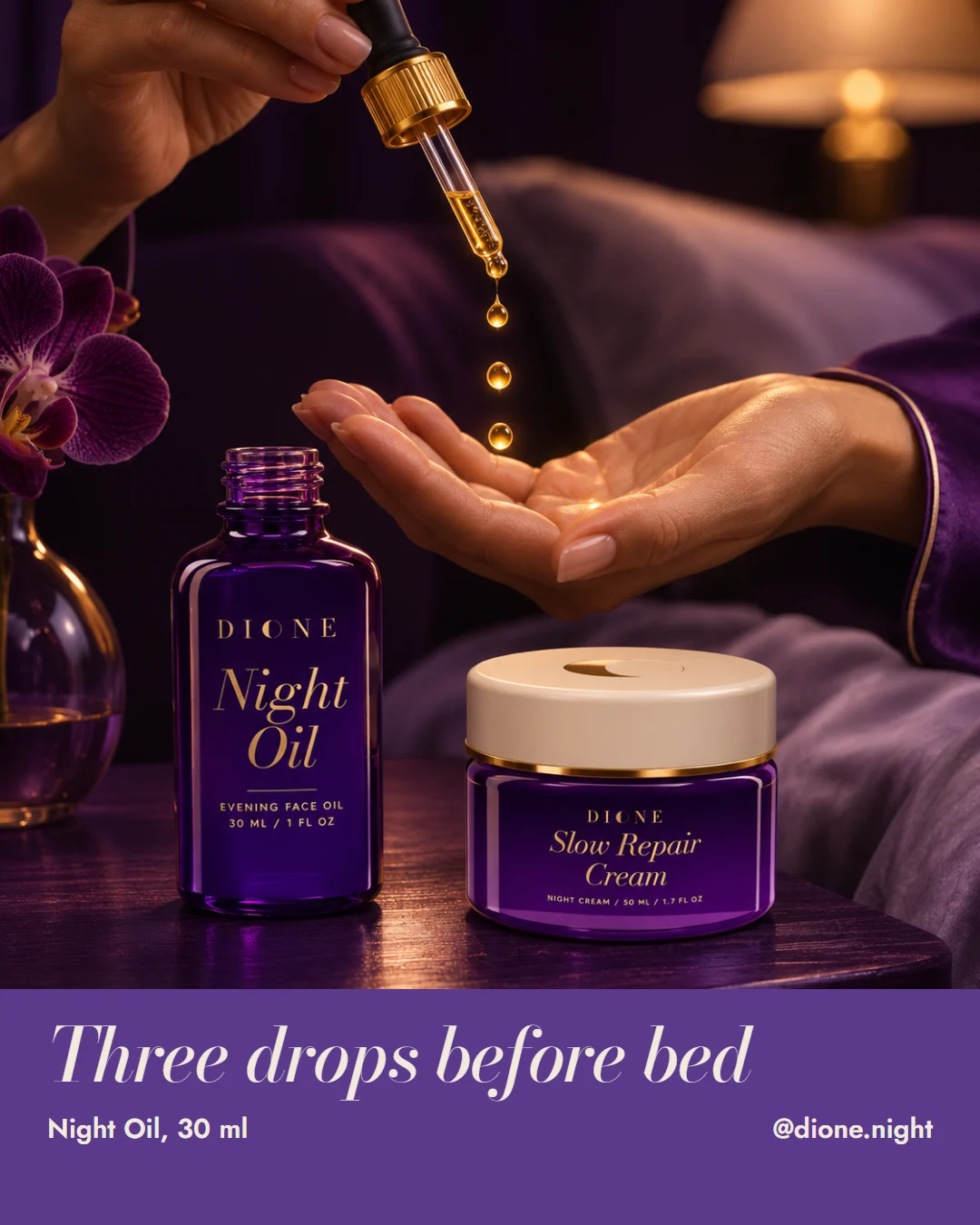
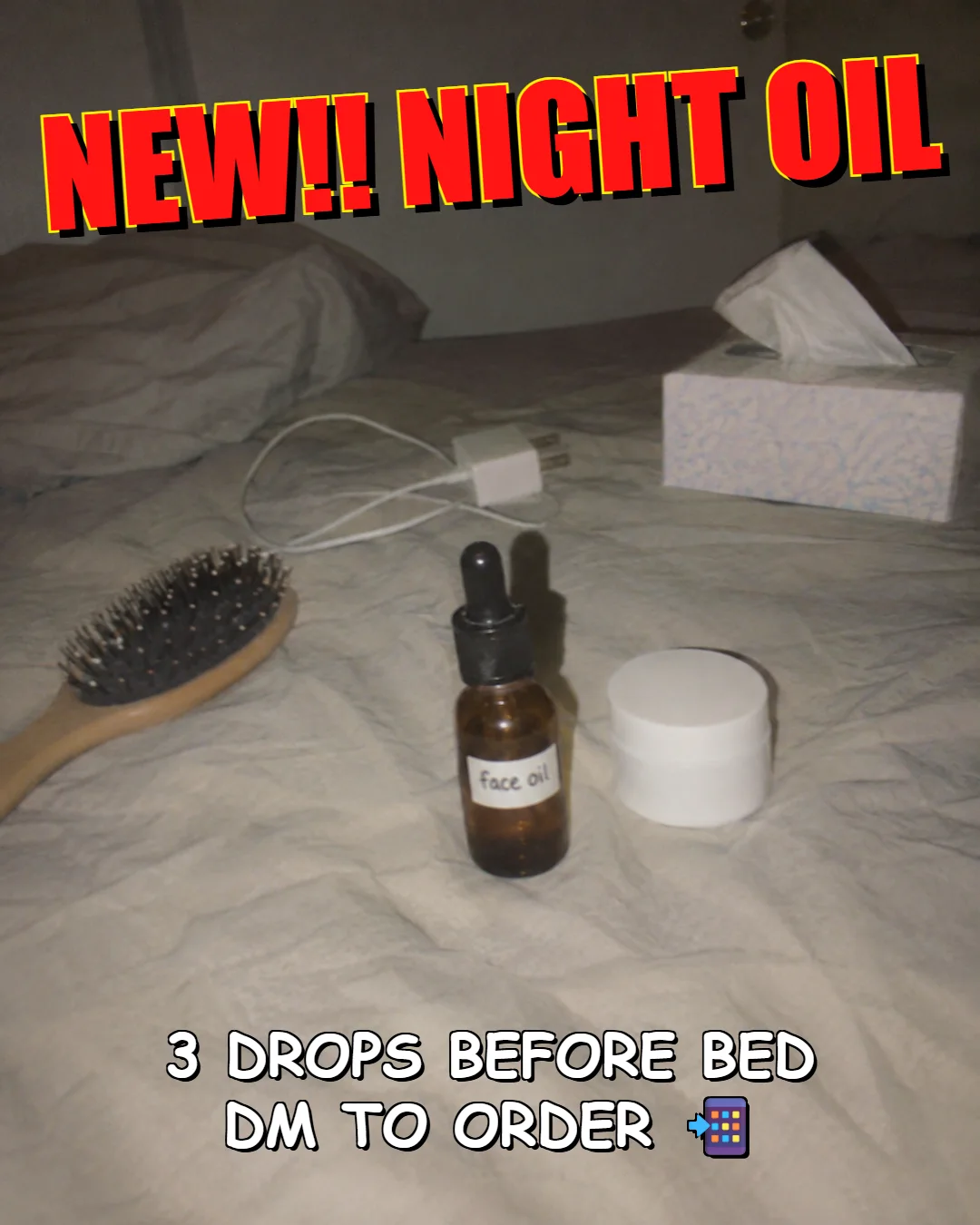
Packaging and product photo
- Before
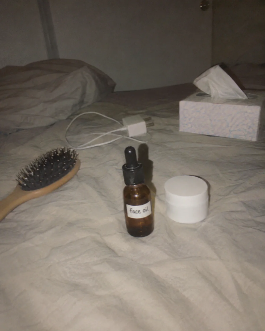
- A plain bottle with a handwritten sticker, shot with the flash on.
- After
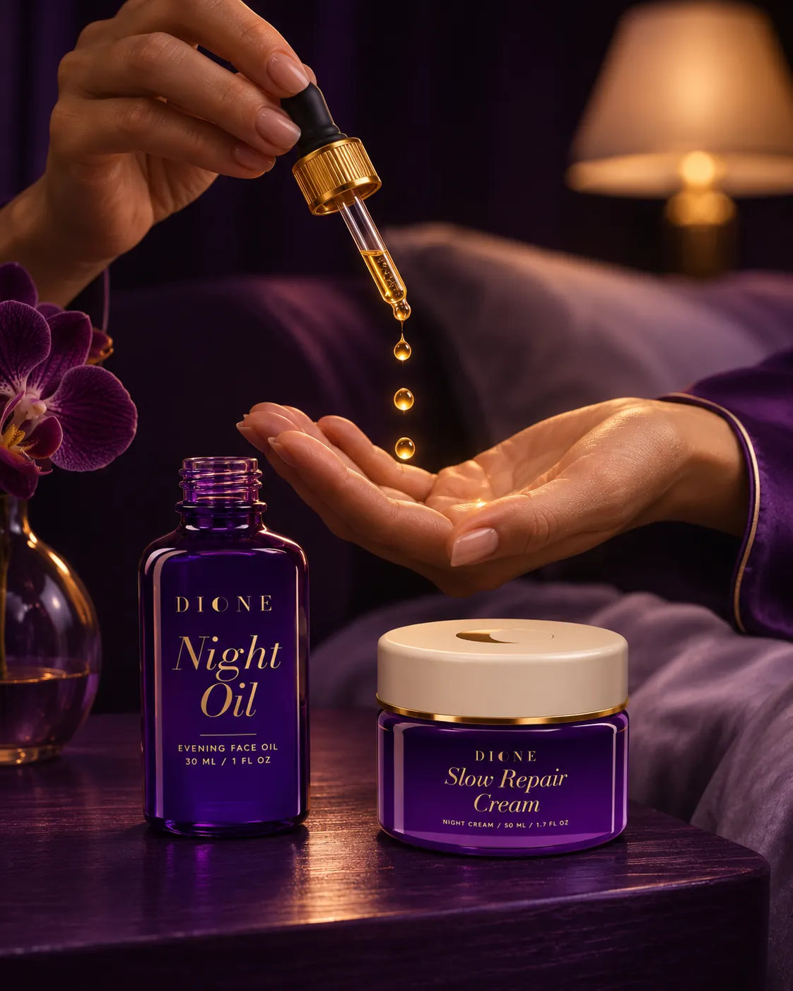
- A printed label and a product photo that sells a calm evening.
 BeforeAfter
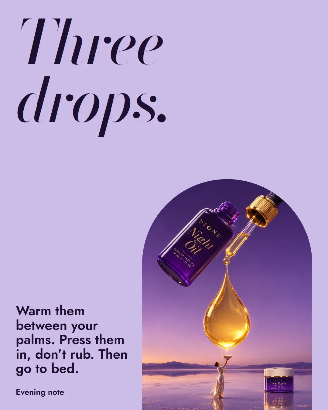
Social post
- Before
- New product news typed over the bedroom photo.
- After
- One product, one line, and room to breathe.
Raw clipMy edit
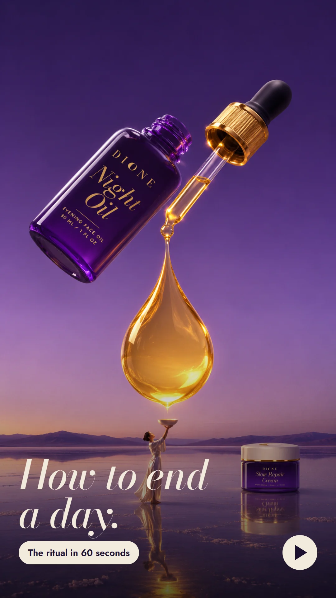
The Reel
- Before
- One flat phone clip of the bottle on a kitchen counter.
- After
- A 26-second Reel that rebuilds the same clip on screen, one edit at a time.
Press play, then drag the line. I staged the raw clip too.
Everything in the project.
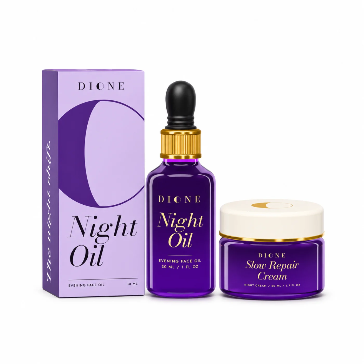
Product images
The Shopify store
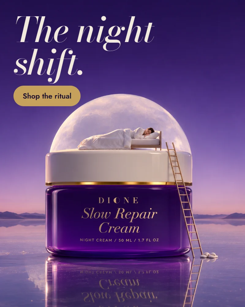
Banners
Social
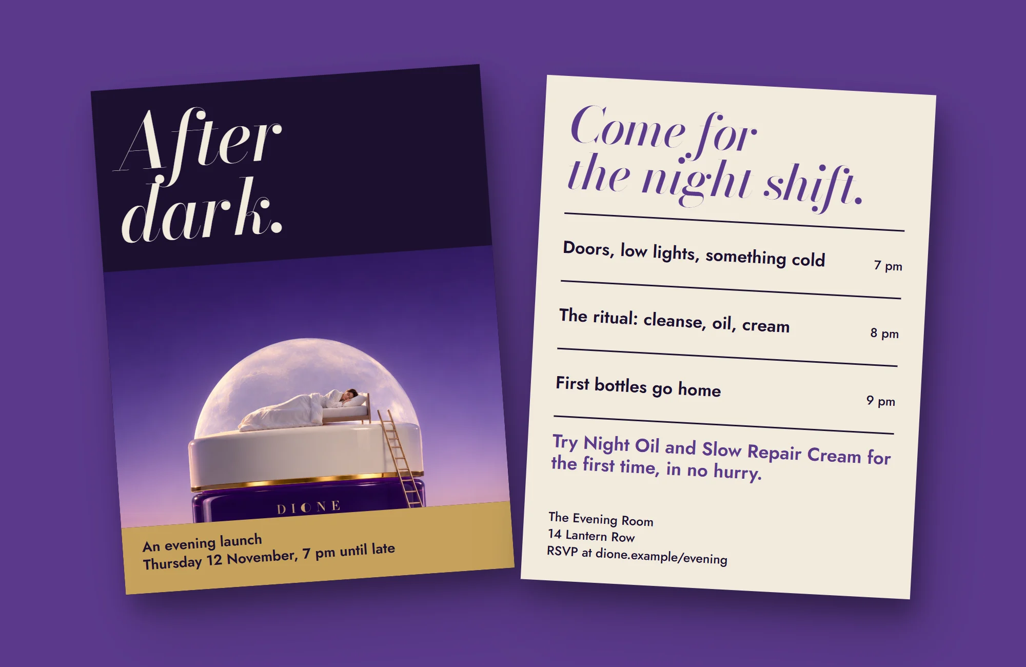
Campaign images