snackhound
Sit. Stay. Snack.
Dog treats. Logo, packaging, store, banners, social, print
 BeforeAfter
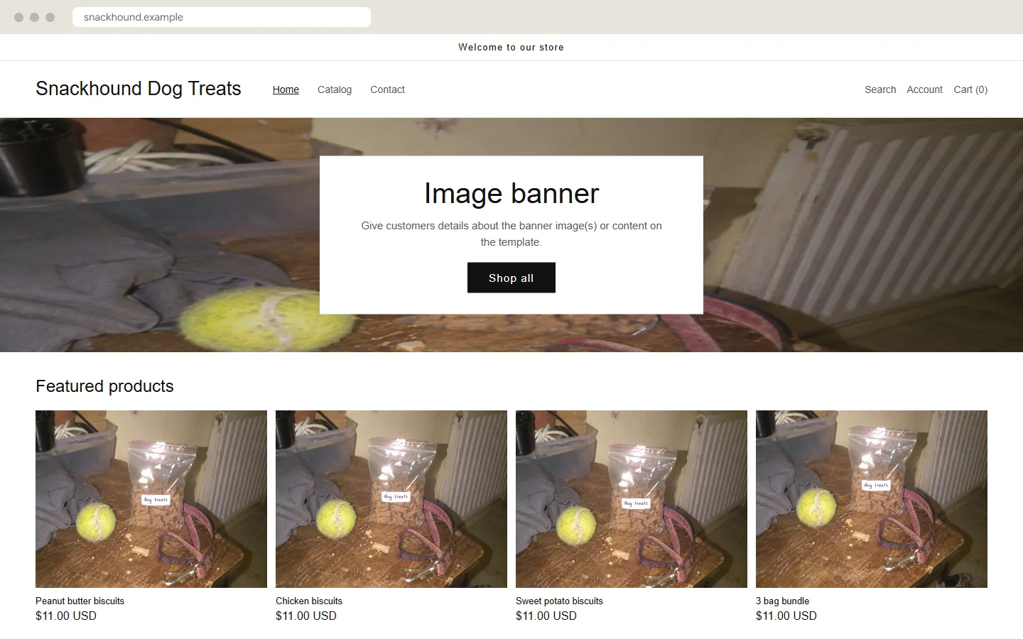
- Before
- A default theme where every product has the same blurry photo.
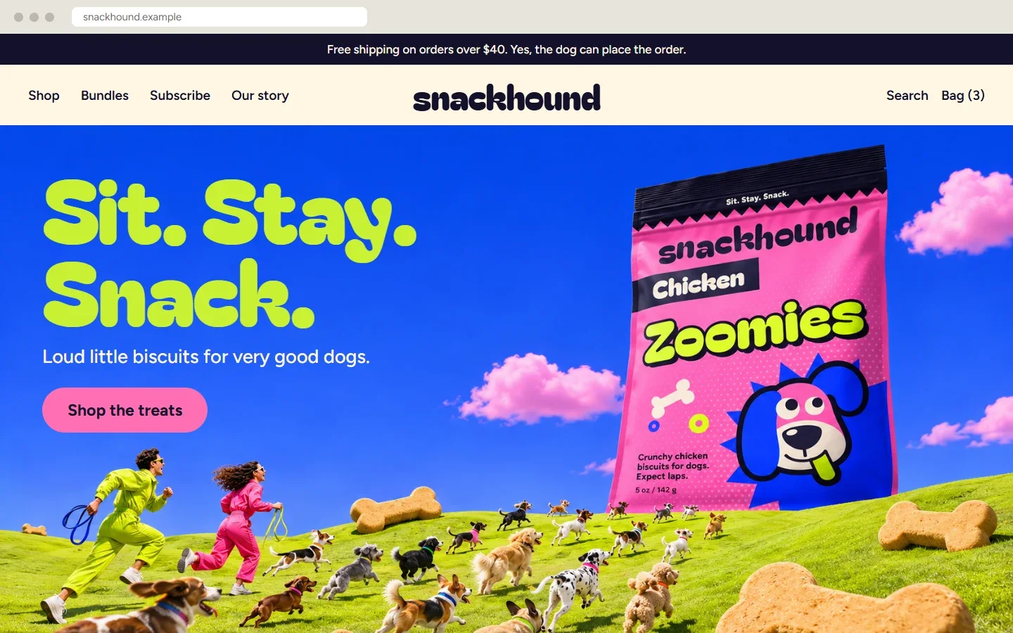
- After
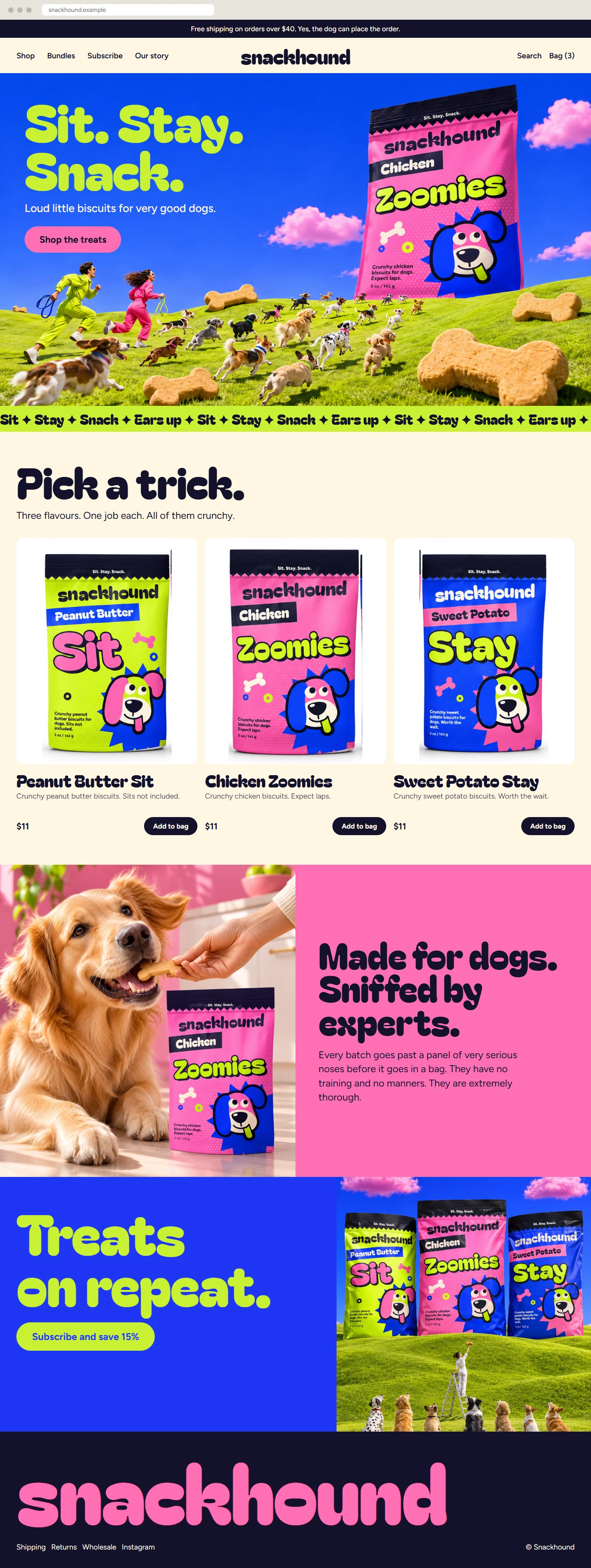
- A loud, happy home page that looks like the bags.
This shop is not real. I made it to show what a full project looks like, and I made the “before” versions too. The name, products, prices and addresses are invented.
The idea
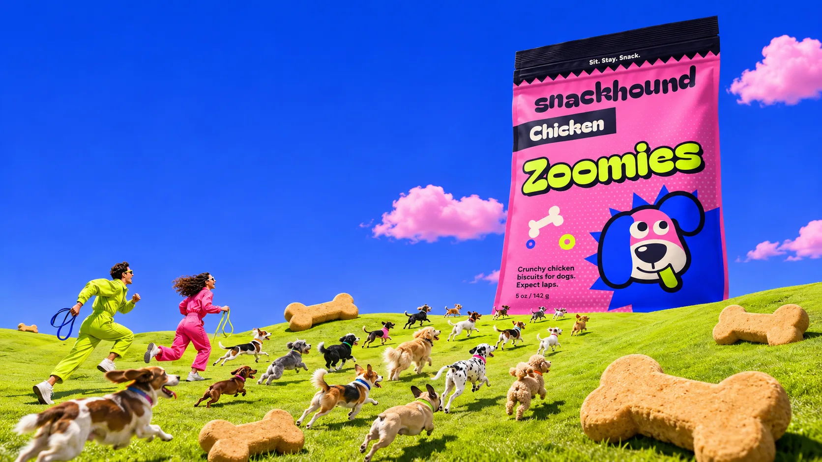
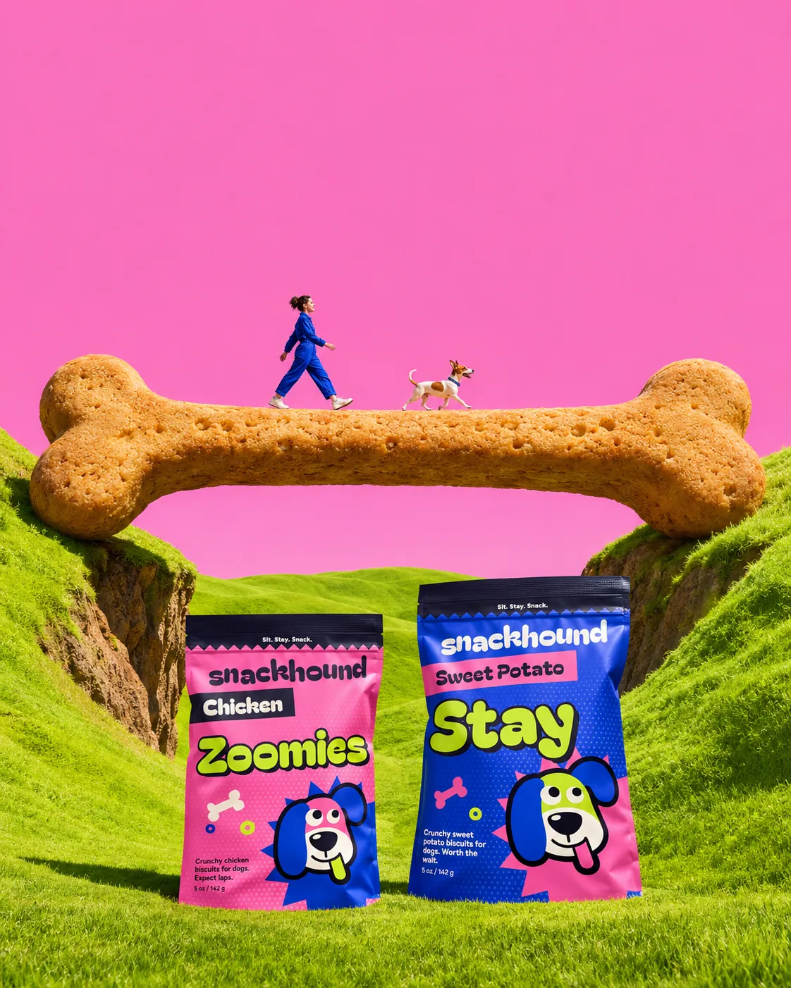
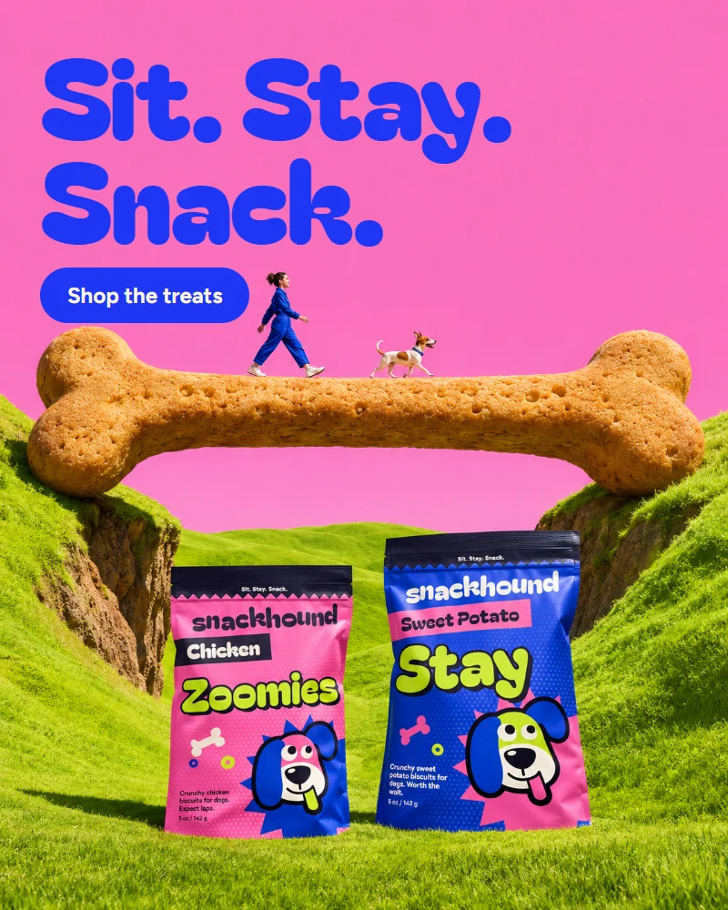
A bag of dog biscuits, treated like a comic-book event. Sticker-thick letters, dots and starbursts, plus a googly-eyed hound with one ear up and one ear down. In the campaign the bags and biscuits grow as big as hills and the dogs run straight at them, so every layout feels like the best walk of their lives.
- Category
- Dog treats
- Typefaces
- Bagel Fat One, Figtree
- Colours
- Bubblegum, Cobalt, Lime, Cream, Ink
Piece by piece, before and after.
 BeforeAfter
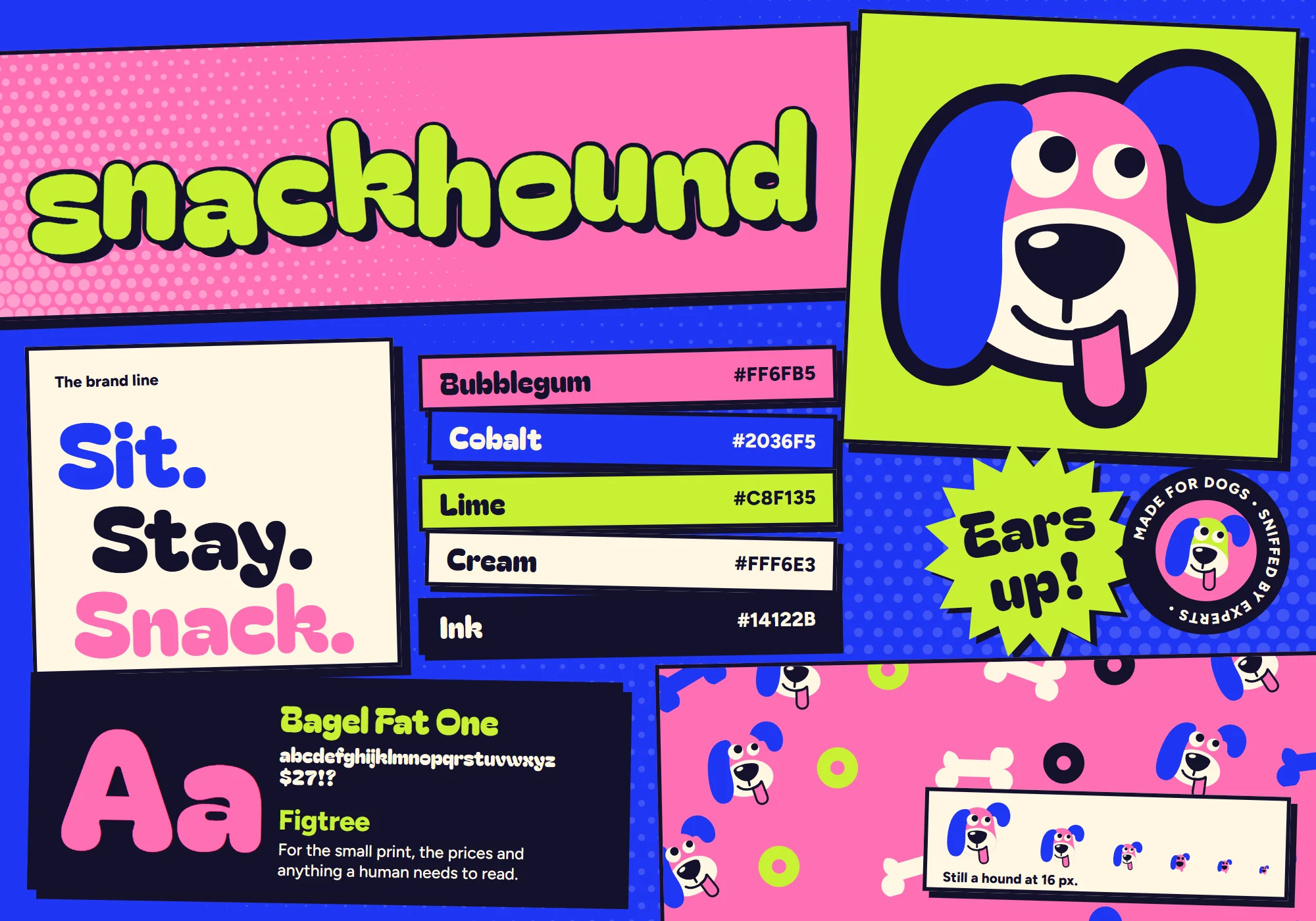
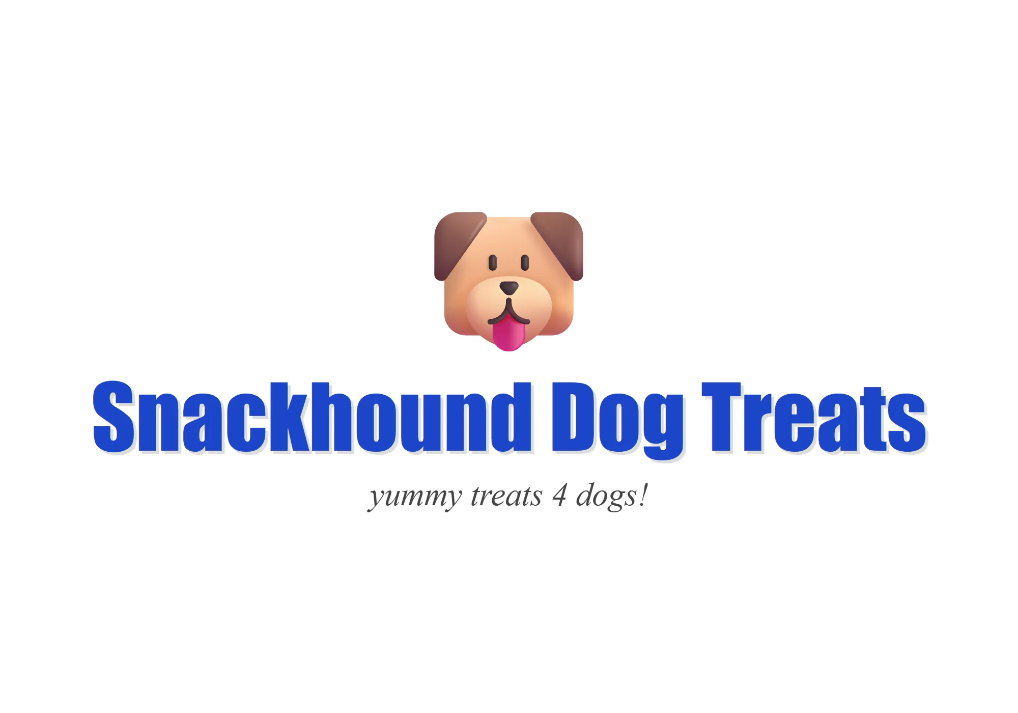
Logo and brand kit
- Before
- A name typed in a free font, with an emoji for a mascot.
- After
- A logo, a mascot, colours and type that work on every bag.
 BeforeAfter
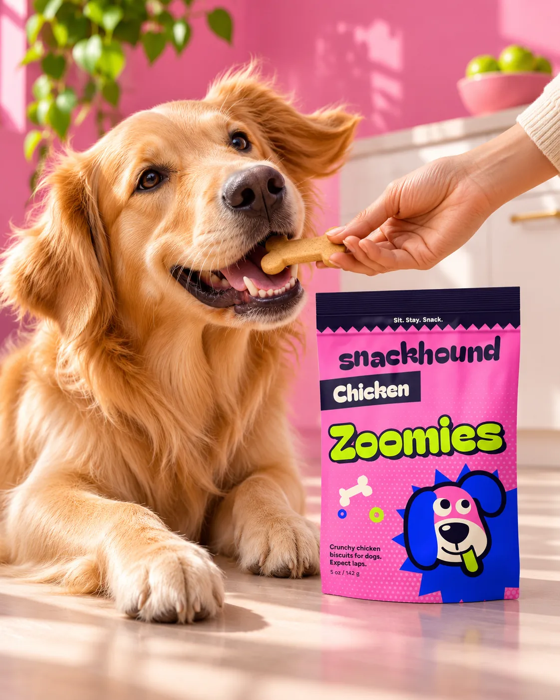
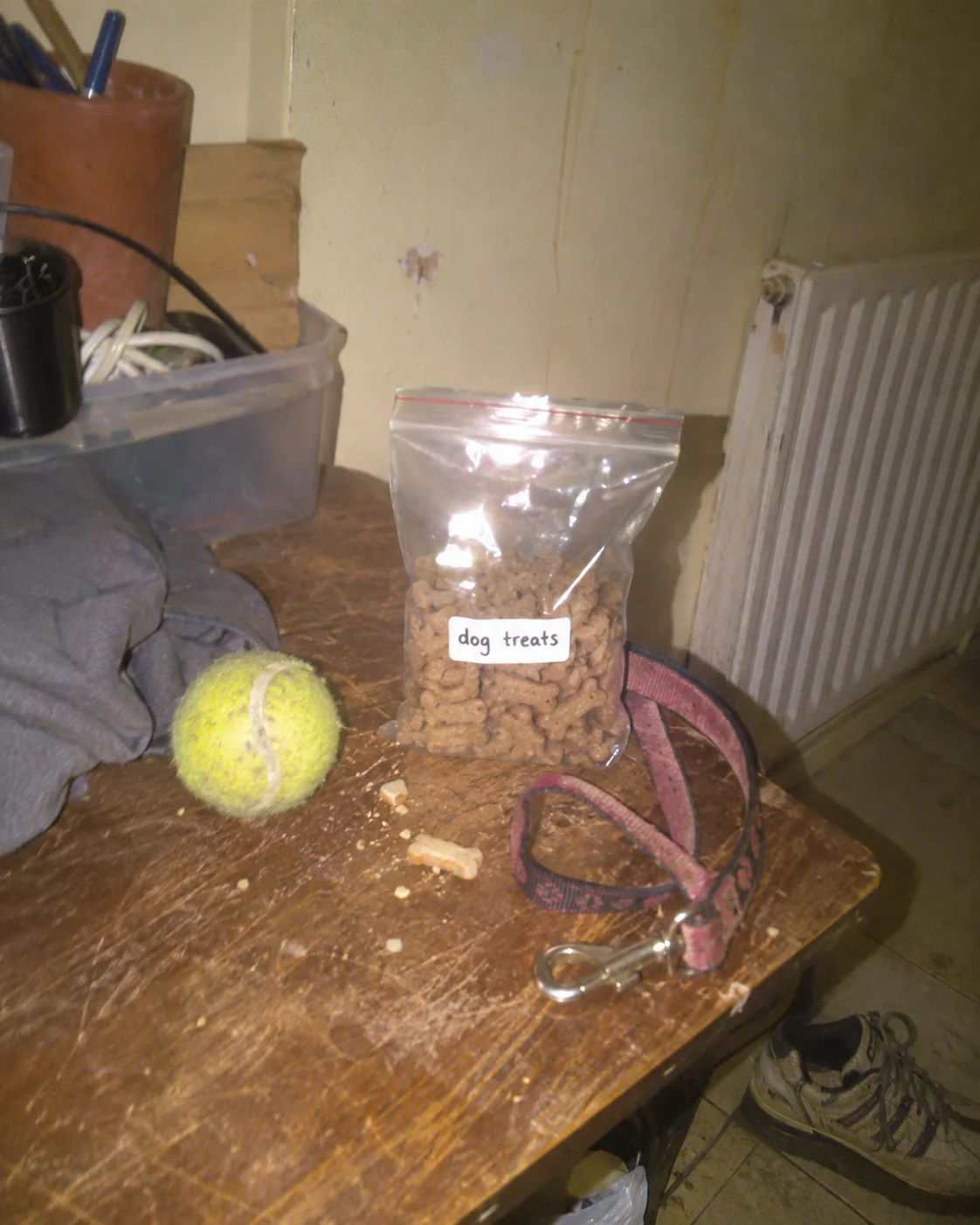
Packaging and product photo
- Before
- Biscuits in a zip bag with a marker label, on a scratched table.
- After
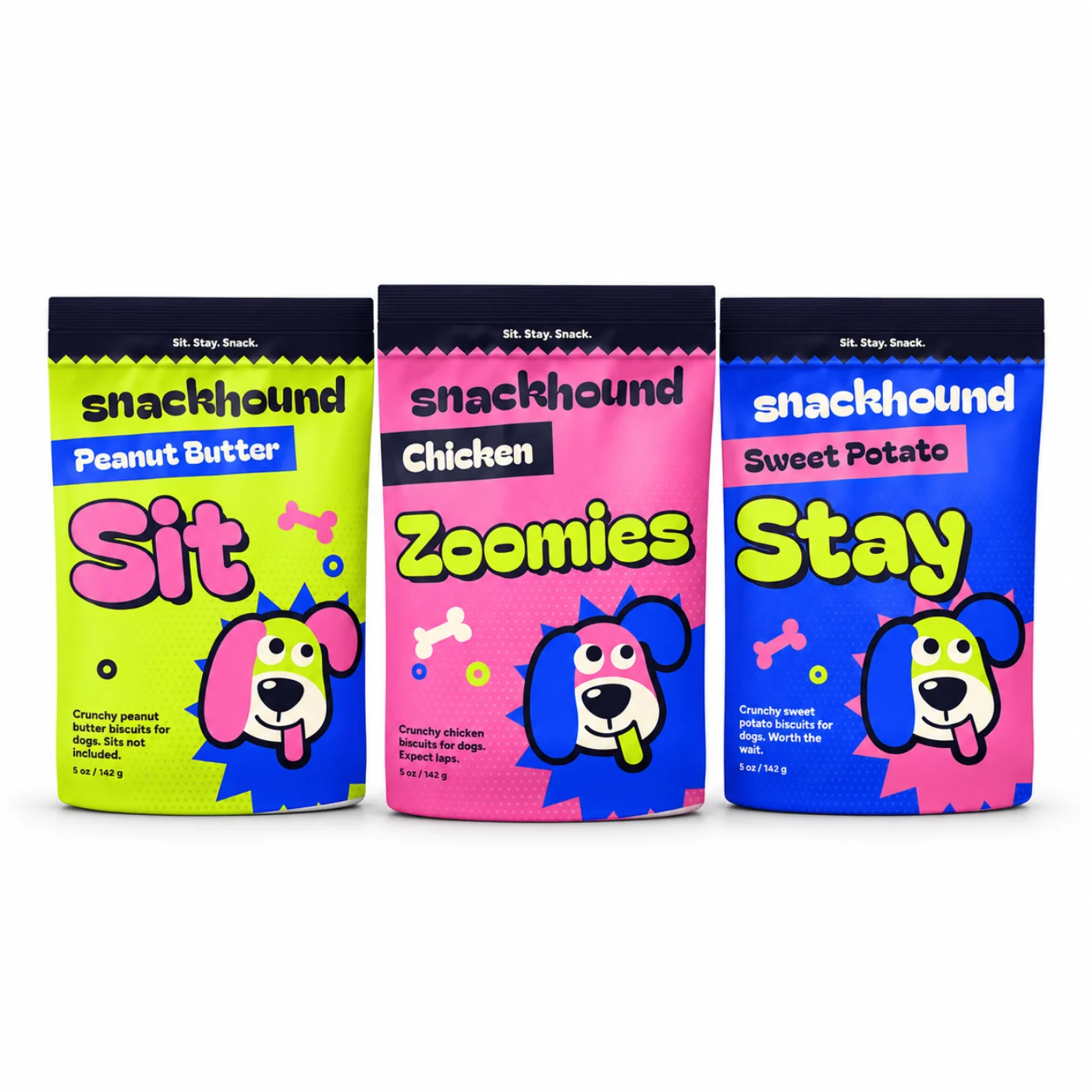
- A printed bag and a very happy dog.
 BeforeAfter
Social post
- Before
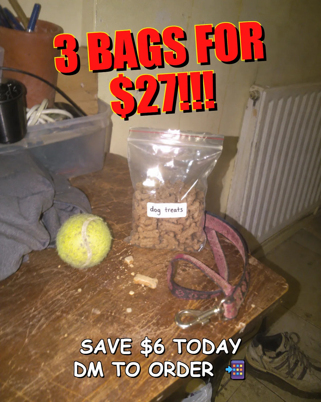
- A bundle offer in red capitals over the table photo.
- After
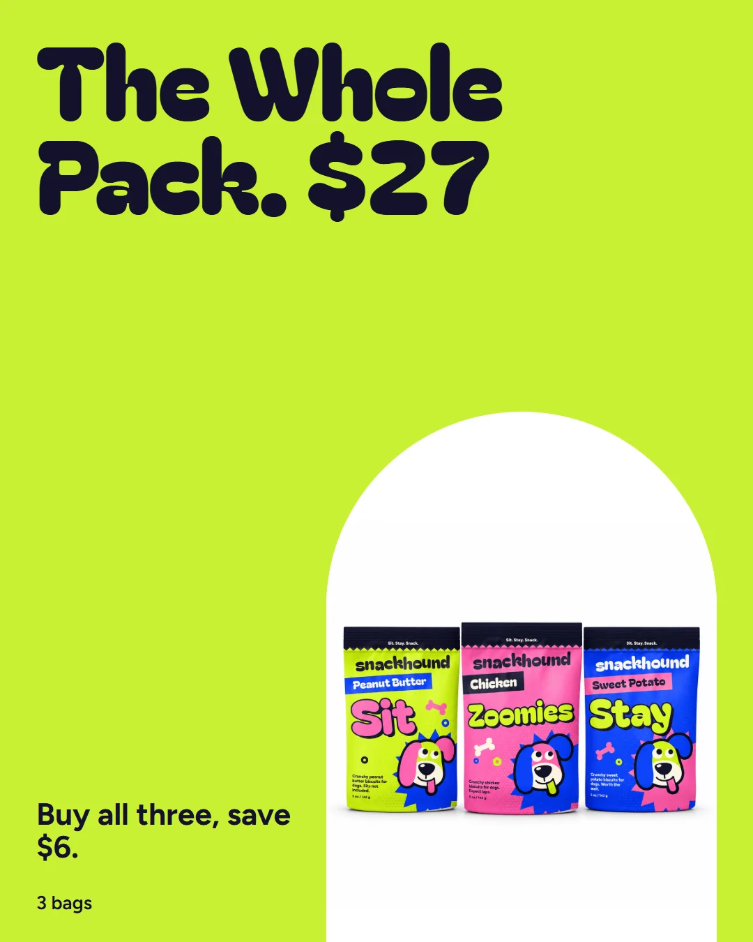
- The same bundle, with all three bags and one clear price.
Raw clipMy edit
The Reel
- Before
- A shaky home clip of the dog and the bag.
- After
- A 22-second news-style ad with a hook, captions, voice, music and sound.
Press play, then drag the line. I staged the raw clip too.
Everything in the project.
Product images
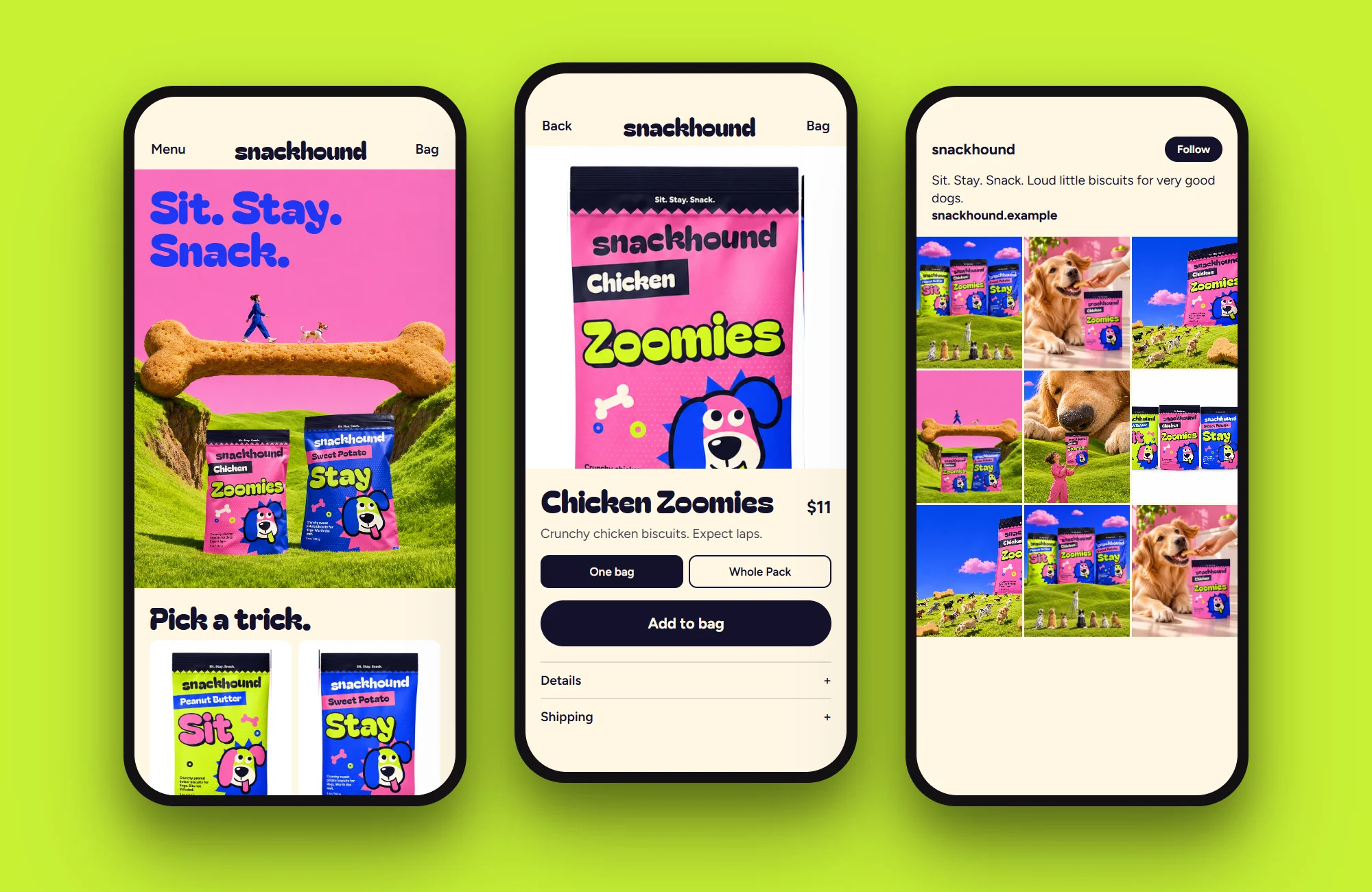
The Shopify store
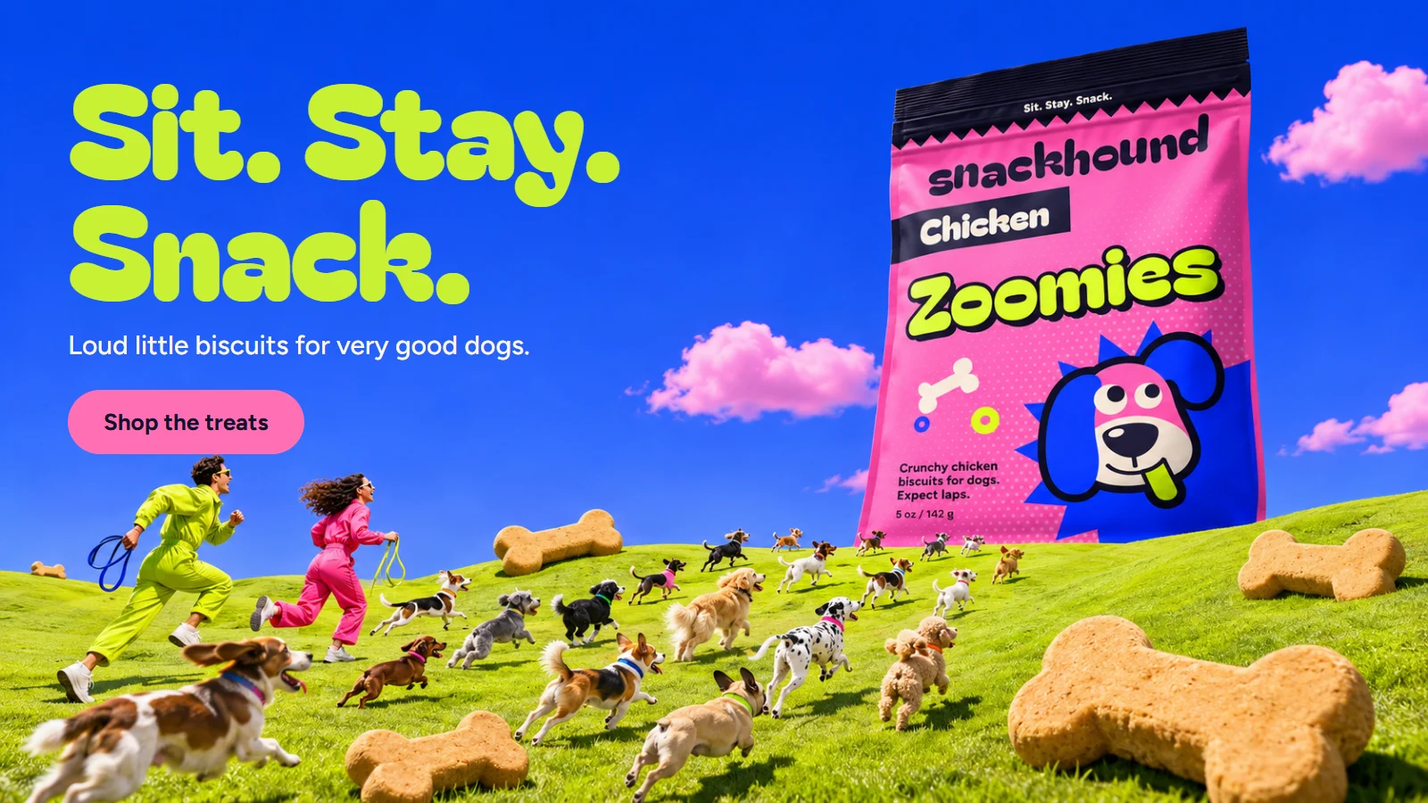
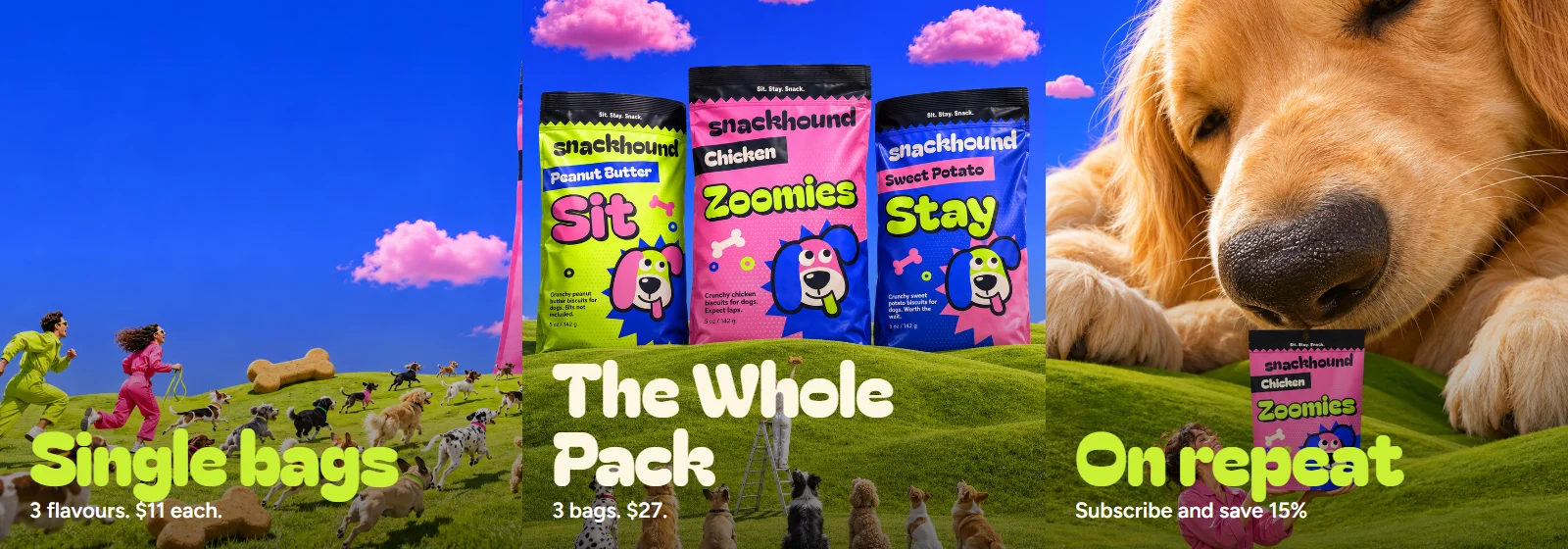
Banners
Social
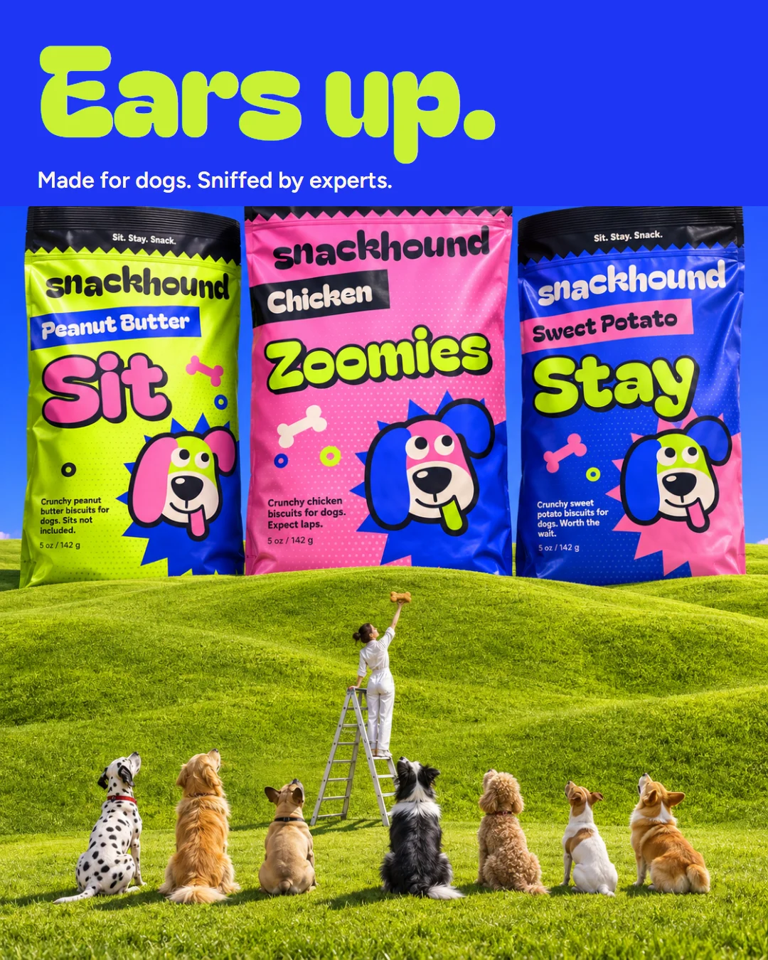
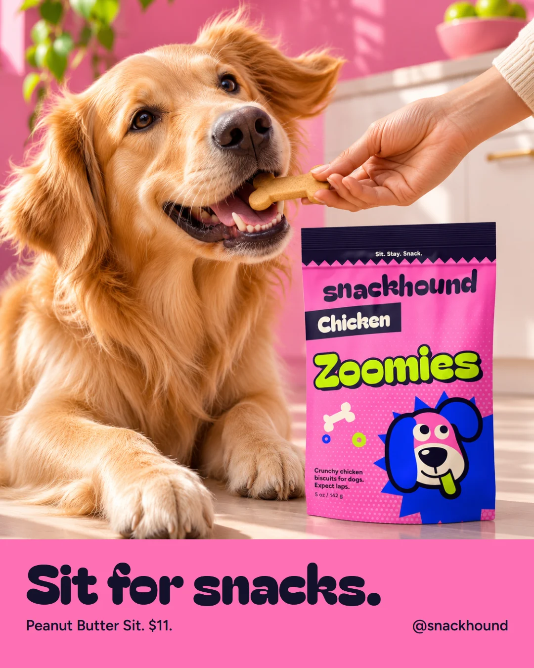
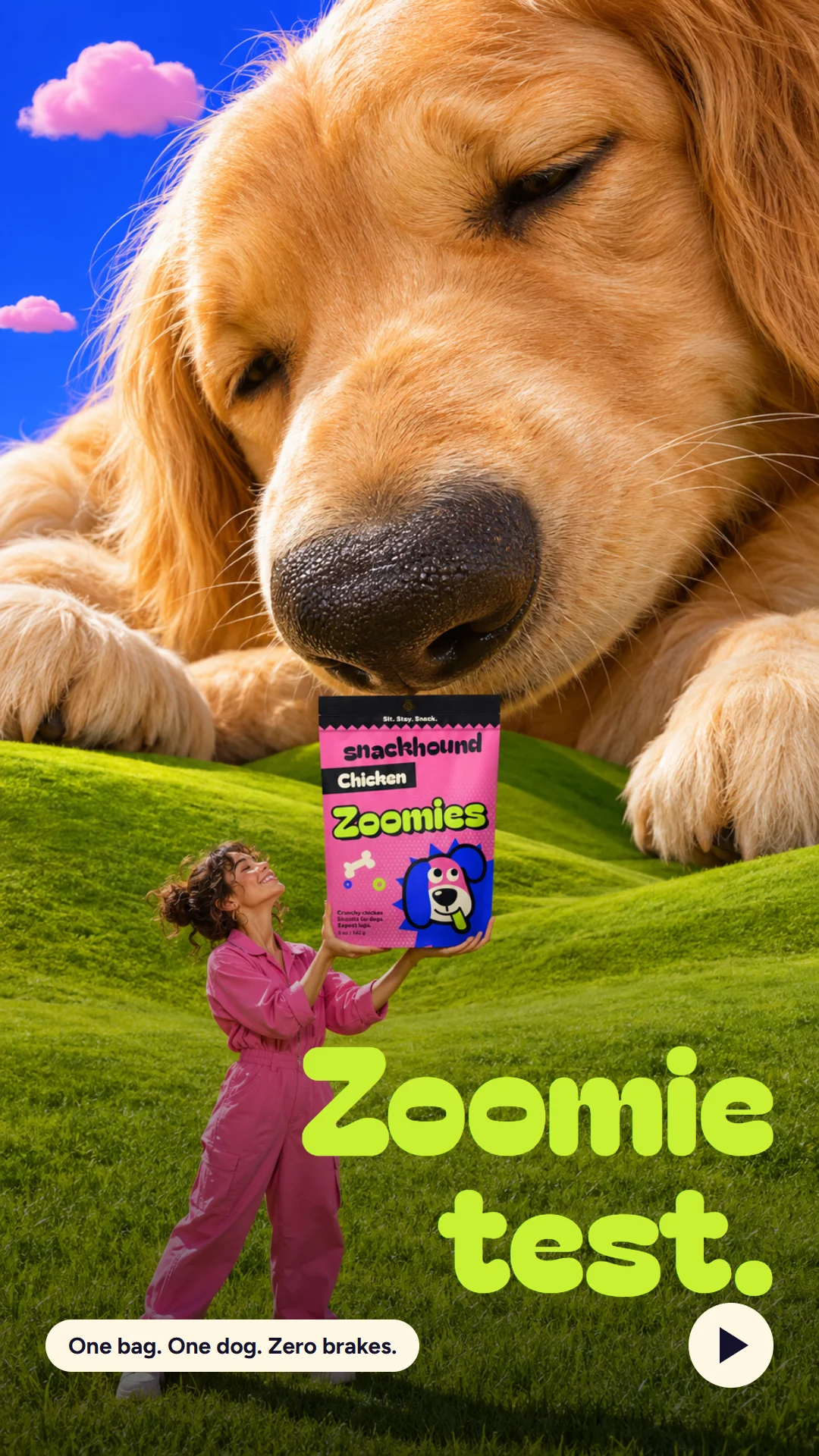
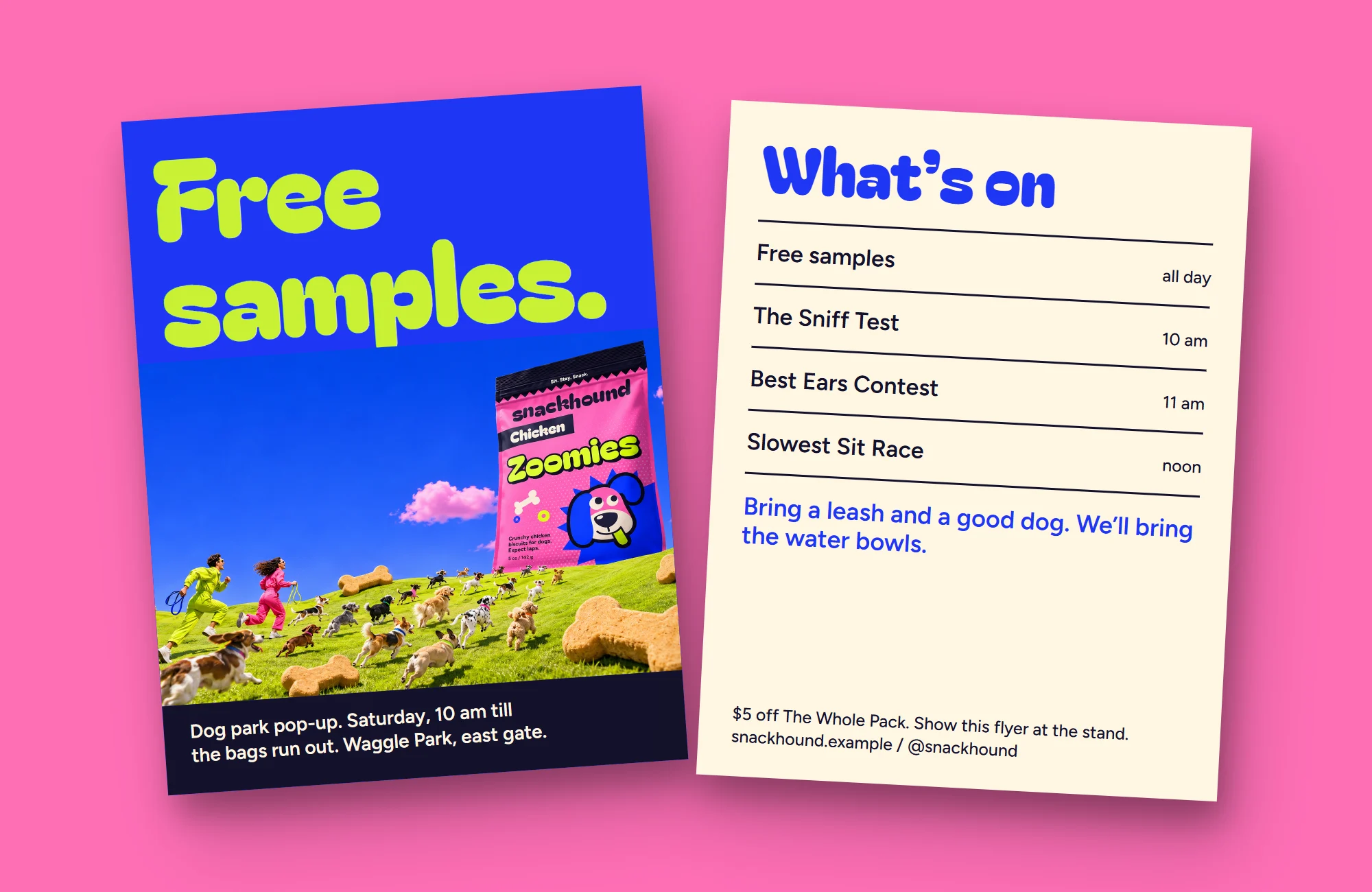
Campaign images